Ayatas Technologies
  • About us
  • Our Services
        • Our Services

        • Ecommerce Development
          • Magento

            We can proudly say that our certified team of Magento specialists is our biggest asset because they regularly polish their skills with the latest versions of Magento.

            Explore Now

            Woocommerce

            WooCommerce is a readily-available open-source WordPress plugin which is still a preferred eCommerce engine for kick-starting a new online business.

            Explore Now

            Shopify

            Choose from a bouquet of our reliable and cost-effective Shopify services. We provide design, development, integration, and marketing solutions

            Explore Now
        • E-Learning Solutions
        • Real estate website design
          • Realestate Website Design

            Ayatas Technologies is an established Web development company delivering responsive and Mobile app development services of any complexity to clients worldwide.

            Explore Now
            • Get In Touch

          • Responsive Website Design
            • Responsive Website Design

              Ayatas Technologies is an established Web development company delivering responsive and Mobile app development services of any complexity to clients worldwide.

              Explore Now
              • Get In Touch

            • Web Application Development
              • Agile Software/Web Application Devlopment

                Ayatas Technologies is an established Web development company delivering responsive and Mobile app development services of any complexity to clients worldwide.

                Explore Now
                • Get In Touch

              • WordPress Development
              • Mobile Application Development
                • iOS App Development

                  Developing for the Apple ecosystem places your app in the hands of dedicated users for one of the international’s most famous brands. With improved cross-device abilities

                  Explore Now

                  Android App Development

                  When it comes to ecommerce websites, good design stands for more than mere aesthetics. It stands for maximum user comfort, efficient information delivery.

                  Explore Now

                  Windows App Development

                  Native applications for windows phone are written in Visual C++, a long time and prolific programming language. The language allows developers to tap immediately.

                  Explore Now
              • Digital Marketing Services
                • Digital Marketing Services

                  Ayatas Technologies is an established Web development company delivering responsive and Mobile app development services of any complexity to clients worldwide.

                  Explore Now
                  • Get In Touch

                • Dedicated Development Teams
                  • Dedicated Development Teams

                    Ayatas Technologies is an established Web development company delivering responsive and Mobile app development services of any complexity to clients worldwide.

                    Explore Now
                    • Get In Touch

                  • Be our Partner and enjoy the benfits
                  • Call Us Now +1 916-936-8099
                  • Email Us info@ayatas.com
                  • Let’s Talk ayatas
            • Our Work
            • Blog
            • Contact Us
            • About us
            • Our Services
              • Ecommerce Development
                • Magento
                • Woocommerce
                • Shopify
                • BigCommerce
              • Real Estate Website Design
              • Responsive Website Design
              • Web Application Development
              • WordPress Web Development
              • Mobile Application Development
              • Digital Marketing Services
              • Dedicated Development Teams
            • Our Works
            • Blog
            • Contact Us
            Request a Quote

            Quick Contact

            Feel free to drop us a line and we'll get back to you with in 24 hours time

              Call Us Now +1 916-936-8099

              Blog

              Latest Technological Trends & Insights + Actionable Advice

              Work with us

              How Responsive Web Design Works?

              By Ashley Nelan February 18, 2021 76 Views

              Before the advent of Internet-ready mobiles or more than a decade ago, people used to view websites on static computer screens. Websites at that time were designed in single resolution was quiet enough. In this 21st century, Internet has emerged and has been introduced into every mobile. Users are surfing the Internet from Internet-enabled mobiles, so websites have to be designed to fit every screen or device.

              Even before Responsive design was introduced, mobile web design was introduced. In mobile design, the website is entirely designed to be viewed on mobile and provide content based on the resolution of mobiles like iPad, Kindle, Netbook, and Blackberry. The mobile website is mainly designed to reach the target customers who are mostly using mobiles. Mobile design and Responsive Web design are different.

              What Is Responsive Web Design?

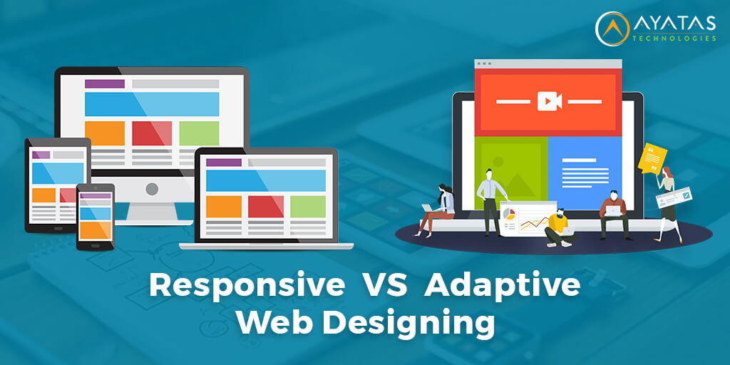
              The way of developing websites according to the behavior, environment, and screen resolution of a user is called Responsive Web design. Responsive web design involves the intelligent use of CSS, images, flexible grids, and layouts. In other words, it can be said that the site should respond automatically to user preferences and eliminate the headache of designing various designs based on the screen resolution and orientation.

              Principles Of Responsive Web Design

              Many principles are to be followed to make a responsive website. Three major principles are most important that drive a responsive website design.

              1. Fluid Grid System

              Before the advent of the Internet, the print was displayed in absolute measures, and now the pictures are defined in pixels. Displaying absolute images or text is not possible for mobiles, so the idea of relative sizes is being used. The relative size can be defined by using a simple mathematical formula.

              Relative size (in %) = Target size / Context Size

              Target size is that of the website you are working with, and Context size is the maximum browser window of the mobile user. The relative size is taken in percentage and applied to the CSS script’s appropriate properties. The same principle is applied to all elements of a website.

              2. Fluid Images

              Images play an important role in Responsive web design. The images are scaled to fit the screen used for viewing the website. A simple CSS command is used to determine an image’s pixel size and is scaled accordingly. Using this technique prevents the image from stretching when the screen becomes larger than the image. For better results, it is recommended to use slightly bigger images than the screen of mobiles so that the images can be scaled to any resolution easily.

              3. Media Queries

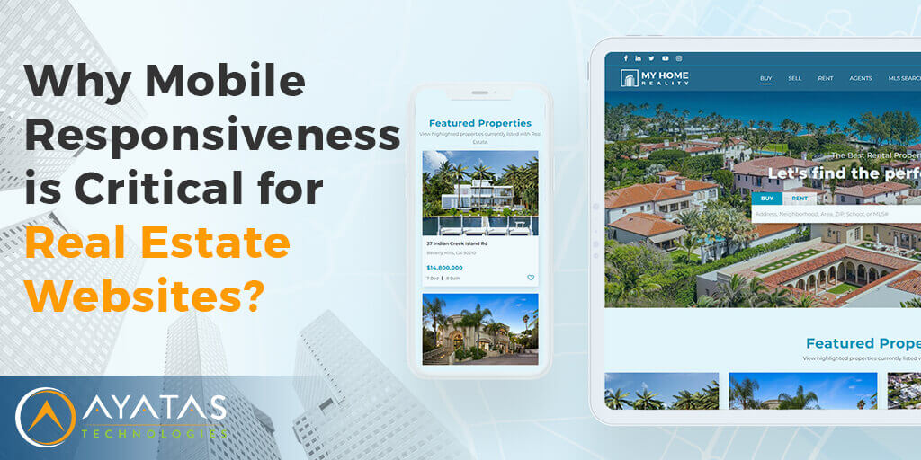
              Media Queries are used to alter the site’s design when certain conditions are met. This approach is useful in designing real estate websites, or in sites, there are multiple columns used for displaying content. Media queries can be used to specify when the screen should be rearranged, and this type of approach works best for “mobile-first” designs.

              How To Make Responsive Web Design?

              A Responsive website can be designed using CSS and HTML but is a lengthy and time-consuming process. CMS or Content Management Software can be used for simply designing a responsive website and even if you do not know to code.

              Here are a few CMS choices

              • CMS Hub
              • WordPress
              • Squarespace
              • Wix

              Best Practices In Responsive Website Design

              Here are some of the essential practices that you need to follow for making your website design mobile-friendly and give a good experience for users

              1. Use Buttons

              Buttons can be used to guide your website visitors to pages that you would like them to visit. Buttons like LearnMore or Download or Buy or Visit for More Details can be more useful.

              2. Use Graphics Or Images That Are Scalable

              If your website includes images, it is suggested to use scalable vector graphics (SVGs). These images can be scales easily according to the screen size and generally in formats like JPG or JPEG. Scalable images also help in improving the loading speed of your site.

              3. Consider Using Typography

              Some fonts look gorgeous on a computer screen but are not readable on a mobile screen. Alternatively, using mobile fonts on a computer can give users a bad experience. So it is better to use fonts that look good both on a computer screen and mobile screen so that users will be able to easily read the content.

              4. Advantage Of New Features

              It is difficult for desktop users to call from their computers instantly, but it is simple for mobile users. To attract more users, you can use features like chat or call now so that users can contact you quickly. Include your business phone number or email for further communication.

              5. Often Test Your Website

              To make sure that your website is responsive, it is suggested that you test your website on various devices. You could also use the Google testing tool to see how your website performs.

              Conclusion

              Using the concept of Responsive Web Design, you could create a site that can be viewed on a wide range of devices and gives your customers the best user experience. If you are looking for assistance in making your website responsive, then our Professional designers at Ayatas Technologies will be there to help you. Contact us for more details.

              case studies

              Whatever may be the industry, technology platform, device, or business objective, we help clients across the world to build meaningful relationships with their customers & grow their brands online using our human-centred design and digital solutions.

              See Our Work
              Wordpress

              Buchan’s Stationary

              Wordpress

              Matt Manero

              Wordpress

              isenberg

              Wordpress

              Bio Solutions

              Wordpress

              Alice Pare

              Magento

              Hoffmeyerco

              Wordpress

              Jays Jems

              Joomla

              Parker Supply

              Let's Grow Your Business Together


                Request a Quote

                Thank you for your interest in Ayatas and our services. Please fill out the request form or e-mail us at info@ayatas.com and we will get back to you promptly regarding your request.

                Request a Quote


                  Select your requirement
                  • Ecommerce Solutions
                  • Magento
                  • Woo Commerce
                  • Real Estate Website Design
                  • Shopify
                  • Wordpress
                  • Web Application Development
                  • Mobile App Development
                  • Responsive Web Development
                  • Digital Maketing
                  • Branding
                  • Hire Dedicated Resources

                  Let's Grow Your Business Together


                    Contact Us

                    500 Capitol Mall, Suite 2350 Sacramento, CA 95814

                    Phone:+1 916-936-8099

                    Email:info@ayatas.com

                    SIGNUP FOR NEWSLETTER

                    Sign up with your email address to receive news and updates.

                    Client Login

                      Quick Links

                      • Home
                      • About us
                      • What we do
                      • Our Works
                      • Blog
                      • Contact Us

                      Our Services

                      • eCommerce Development
                      • E-Learning Solutions
                      • Real estate website design
                      • Custom Application Development
                      • Mobile Application Development
                      • Digital Marketing

                    Copyright © 2007-2020 Ayatas Technologies All rights reserved.

                    To Top

                    Talk to us about your next website project.

                    Work with us
                    This website uses cookies to ensure you get the best experience on our website. Cookies Policy.Got It!
                    Share